
Screens in EVs
Screens let an EV present changing information and reconfigure controls through software, but screen area alone says little about usability. The important questions are what each display is responsible for, how quickly the driver can read it, and how much attention an action requires.
The jobs screens perform
A modern EV may divide information across a driver display, centre touchscreen, climate panel, front-passenger display, rear entertainment screens, and a mobile device. Each location has a different audience and attention budget.
The driver needs a stable view of speed, warnings, state of charge, driving mode, and active assistance. Navigation, charging plans, media, cameras, and vehicle settings need more space and interaction. Passenger entertainment should remain visually and functionally separated from the driving task.
ISO 15008 defines minimum image-quality and legibility requirements for dynamic visual information presented to a passenger-car driver while the vehicle is moving. It covers matters such as character legibility and colour recognition, but excludes maps, camera images, and information superimposed on the outside view. Those exclusions are a useful reminder that “screen quality” is not one single test. ISO 15008:2017 — In-vehicle visual presentation
Driver displays
A digital instrument cluster replaces or supplements conventional gauges. Its strongest use is persistent, glanceable information: speed, state of charge, range context, tell-tales, navigation prompts, power and regeneration, and driver-assistance status.
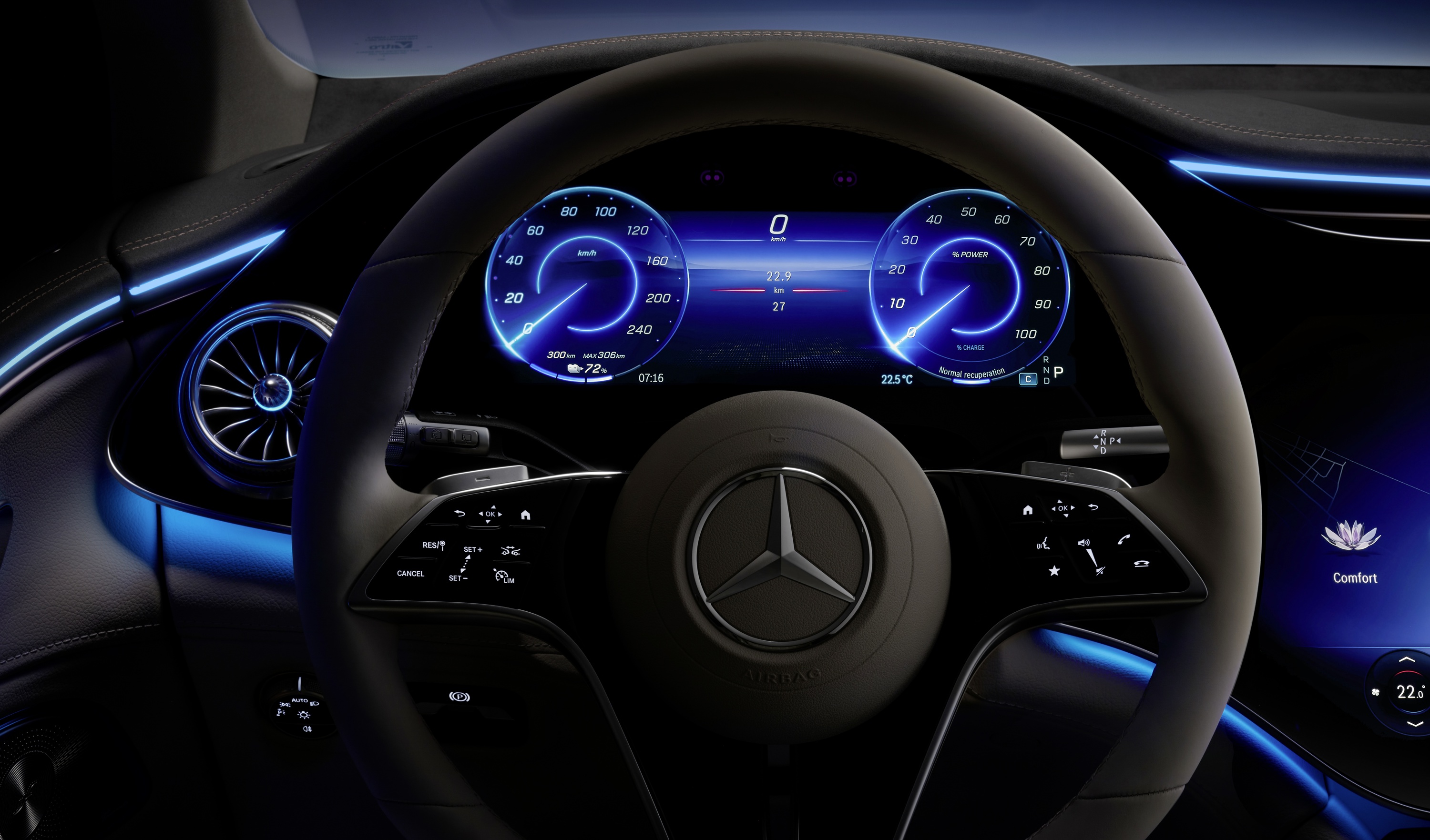
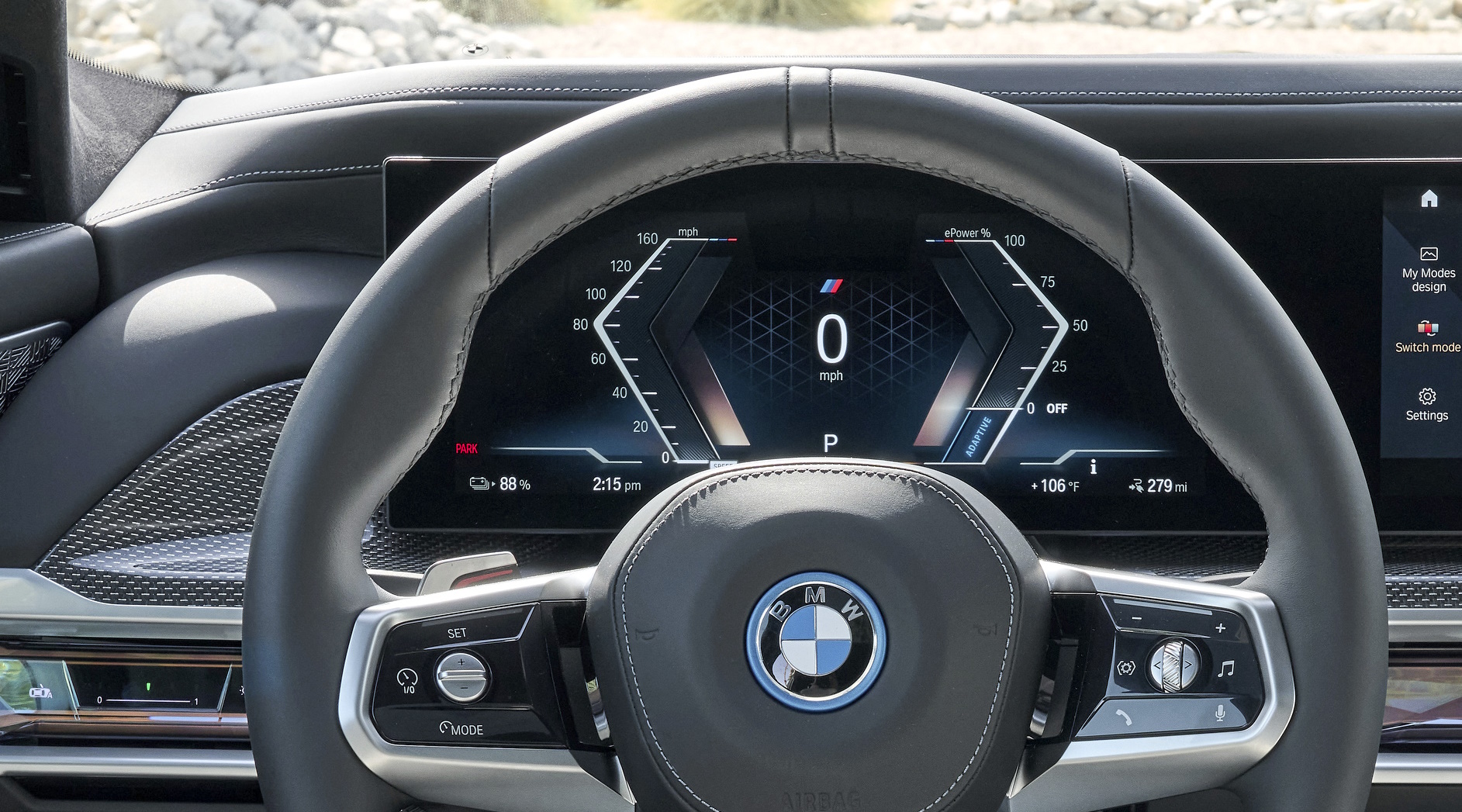
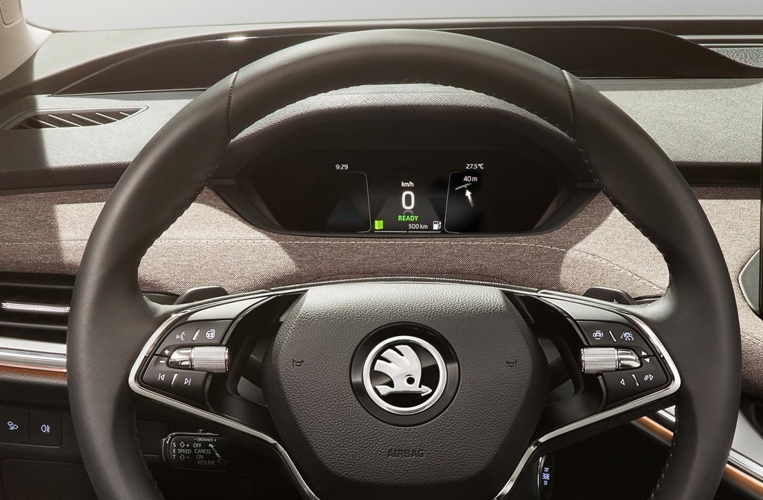
Customization can help if it changes emphasis without moving critical information unpredictably. A driver should not have to remember which layout contains a warning or whether an assistance symbol has disappeared because a theme changed.
The dedicated EV information design chapter explains how state of charge, arrival prediction, consumption, charging, and thermal limits should be prioritised.
Centre displays
The centre display is suited to information-rich tasks: maps, route planning, charger selection, camera views, energy history, media, climate detail, and configuration. It can also become the cockpit’s main failure point if every function depends on one screen, common actions are buried, or an update relocates controls without a clear transition.
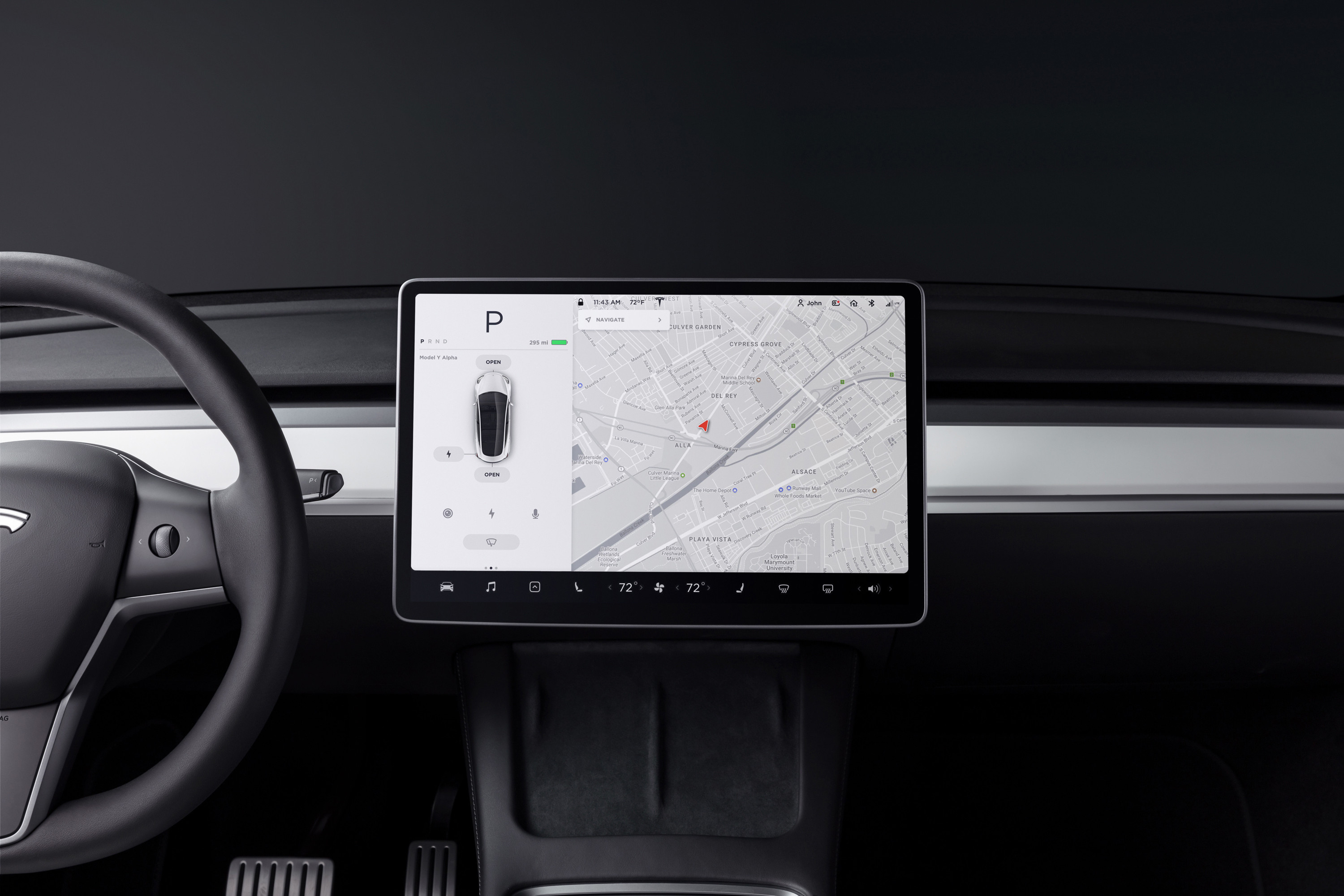
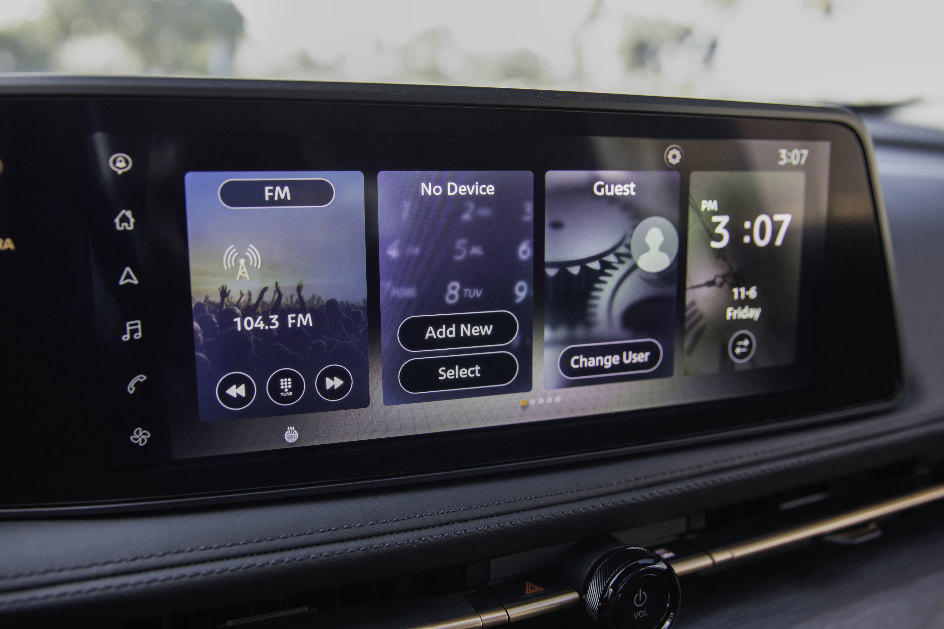
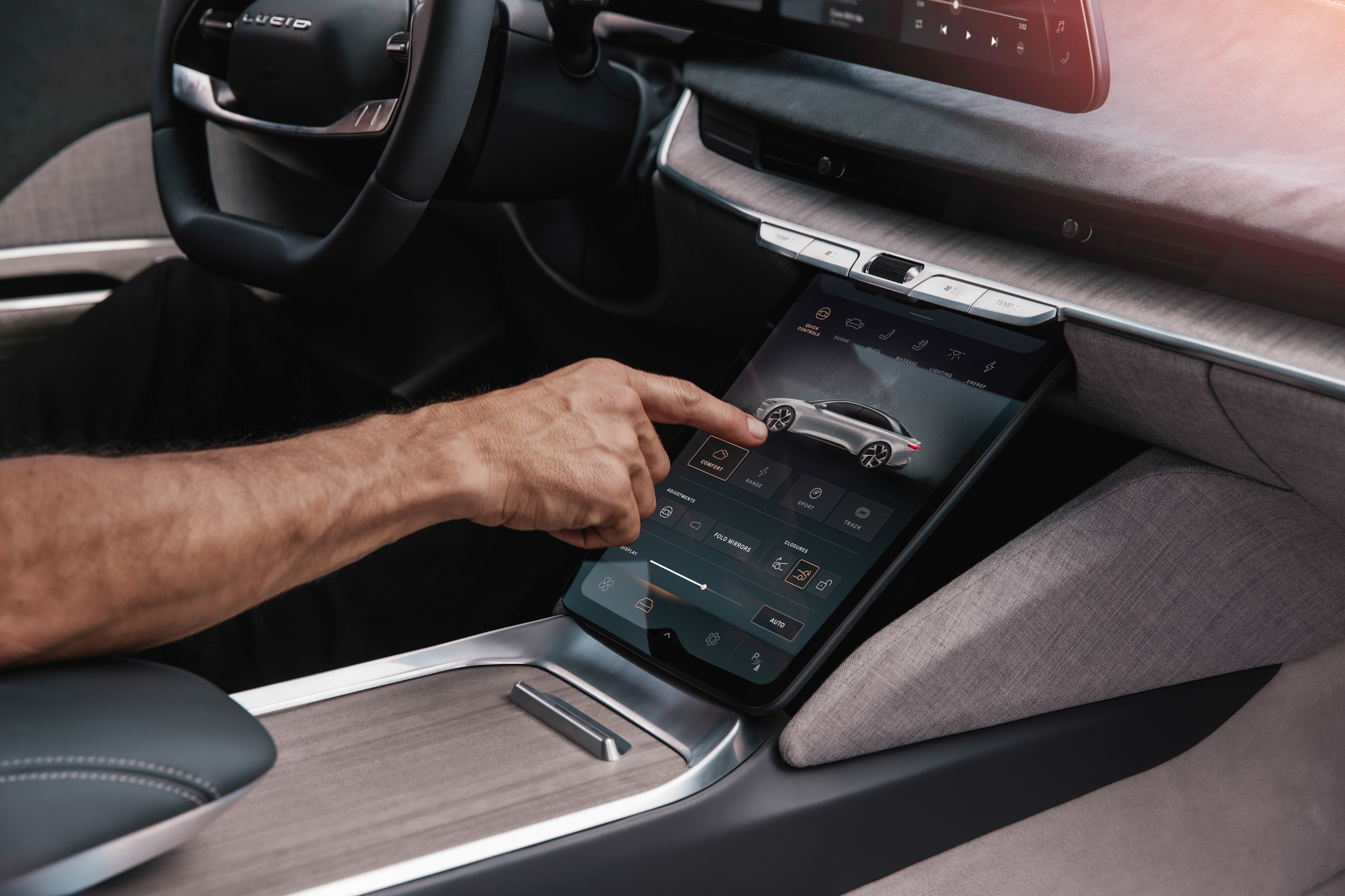

Good software keeps the current driving context visible while a secondary panel is open. It uses large, well-spaced targets; limits long lists and text entry while moving; preserves a quick path back; and confirms inputs without demanding another long glance.
ISO 16673 specifies an occlusion method for measuring the visual demand of in-vehicle visual or visual-manual interfaces. NHTSA’s voluntary guidelines likewise assess complete tasks rather than treating a large touch target as proof that an interaction is safe. ISO 16673:2017 — Occlusion method for visual demand NHTSA — Visual-Manual Driver Distraction Guidelines
Climate and passenger displays
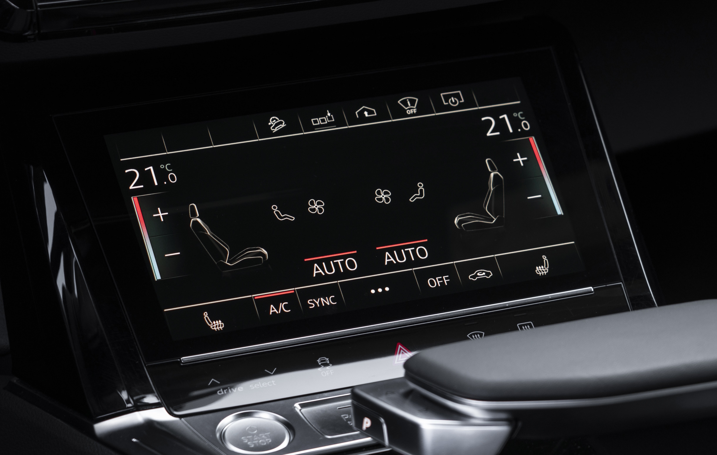
A dedicated climate display can keep comfort controls available while the main screen changes task. The benefit depends on placement, target size, tactile cues, and whether basic demisting and temperature actions remain direct.
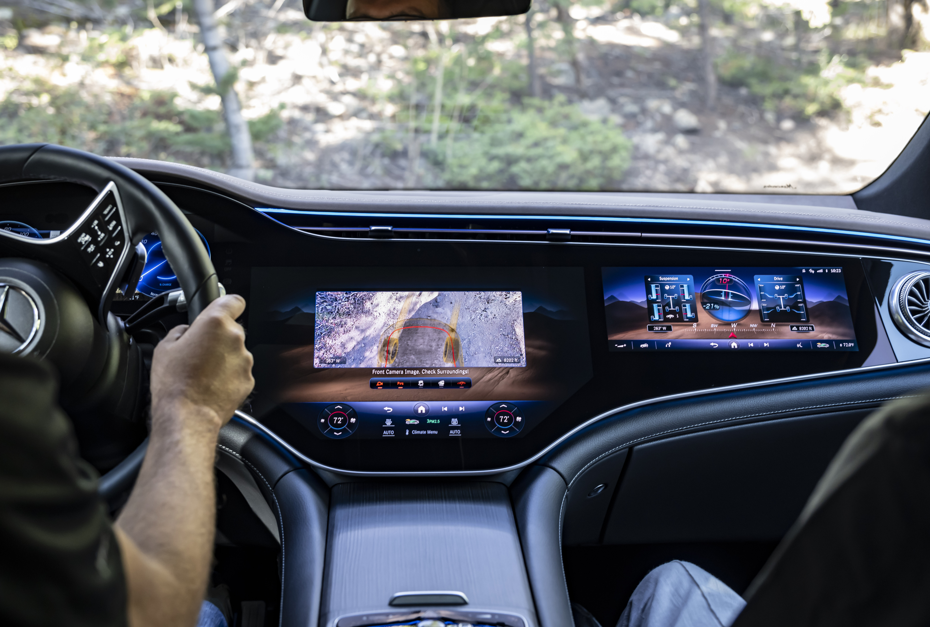
Front-passenger screens can support route input, media, seat functions, and trip information. The system should prevent moving images or interaction patterns from becoming a driver distraction and should make clear which user controls which zone.
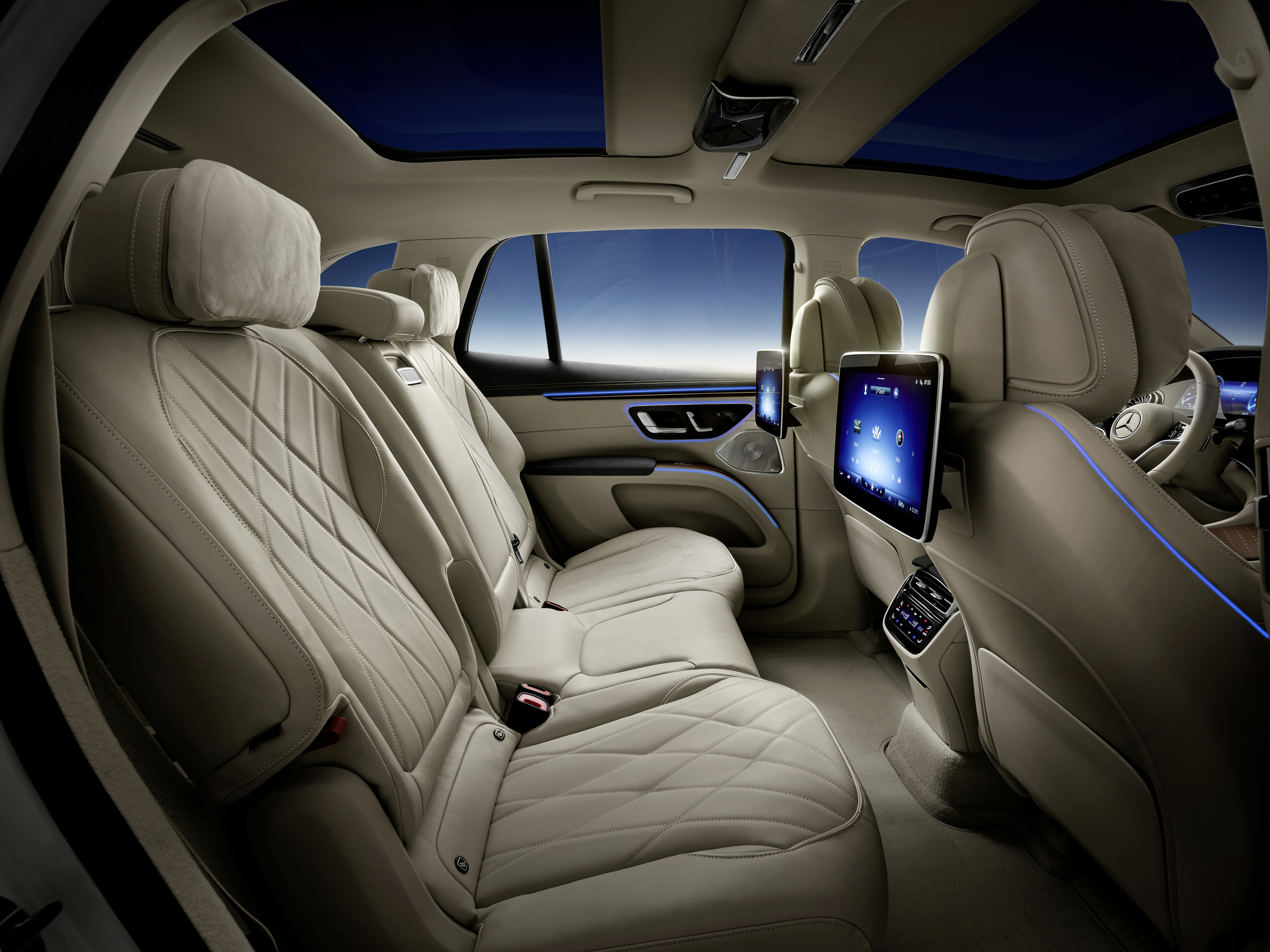
Rear displays are primarily entertainment interfaces. Their mounting, brightness, audio routing, connectivity, and parental controls matter more than their contribution to driving.

Layout, optics, and integration
Display position determines glance angle and reach. A high screen can be closer to the road view but may obstruct forward visibility. A low screen may be easier to reach but require a larger eye movement. A wide dashboard display can distribute tasks across occupants, yet reflections and visual density grow with its area.
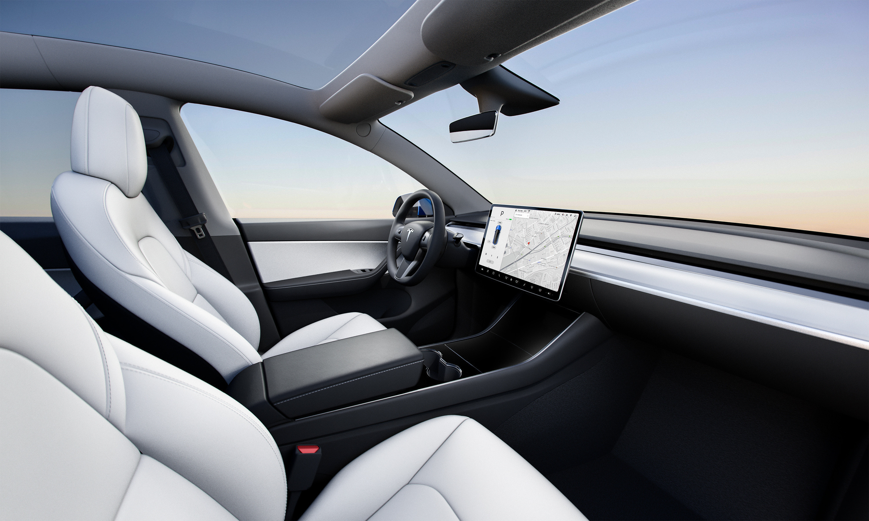
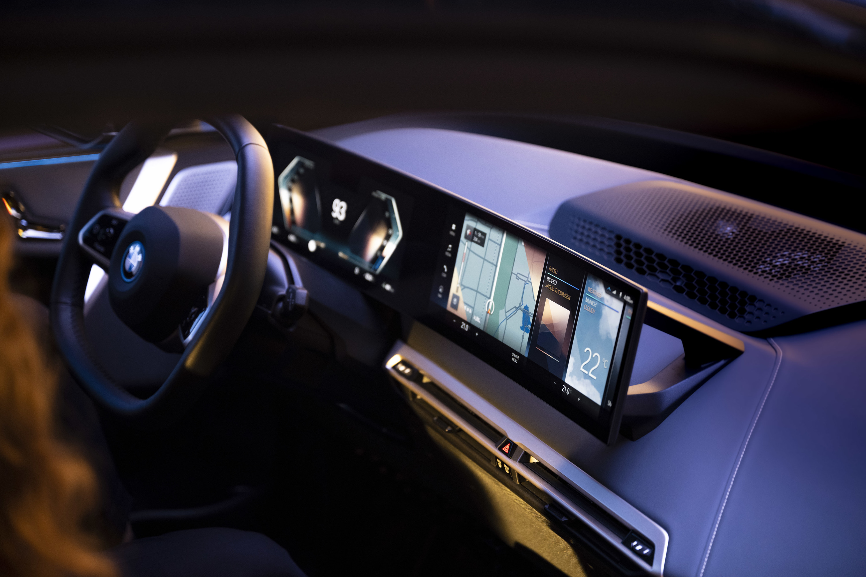
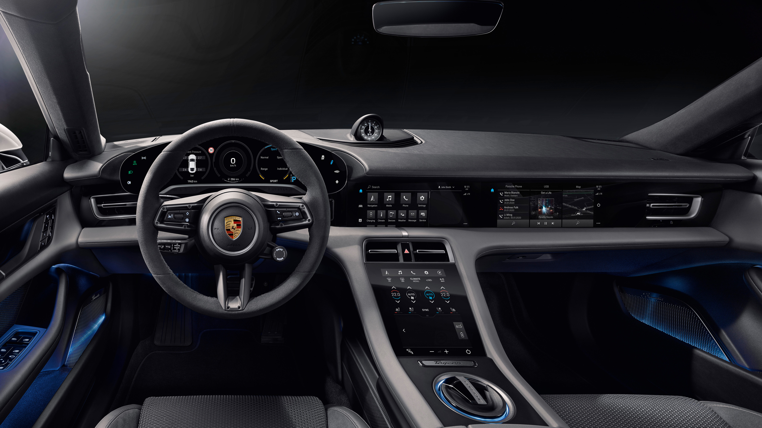

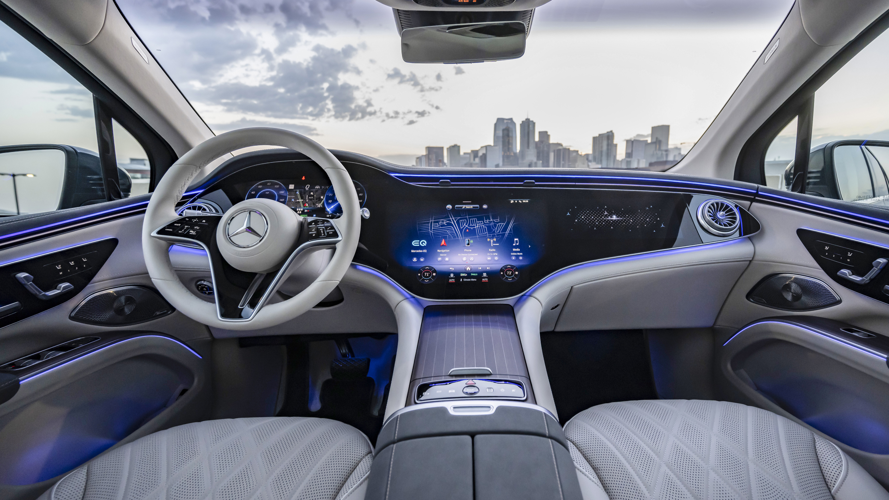
Useful display specifications include luminance range, contrast in sunlight, black level at night, viewing angle, resolution at the normal eye point, refresh behaviour, response to polarized eyewear, and automatic dimming. Touch latency and animation time matter because a visually polished interface can still feel uncertain when feedback arrives late.
Touch input and direct controls
Touchscreens are effective when the user needs a map, keyboard, flexible list, or changing set of choices. They are weaker when the driver must locate a small control by touch, operate it on a rough surface, or repeat an urgent action without looking.
This is not a contest between glass and buttons. A good cockpit uses Physical controls for actions that benefit from stable location and tactile discovery, then uses the screen for detail, explanation, and configuration. Euro NCAP’s current Safe Driving protocol reflects this distinction by assessing direct physical, direct touch, voice, and menu-based inputs according to the function and access path. Euro NCAP — 2026 Safe Driving protocols
What buyers should check
- Are speed, state of charge, warnings, and assistance status readable without changing pages?
- Does the centre display remain legible in direct sun and comfortably dim at night?
- Can temperature, demisting, volume, and key assistance functions be reached without a long search?
- Are touch targets usable while the vehicle moves over an uneven road?
- Does the interface show immediate feedback after every input?
- Can the driver recover quickly from the wrong menu or accidental touch?
- Does a software restart remove essential information or controls?
- Can passenger video or interaction distract the driver?
- Do camera views appear quickly and remain usable in poor light?
The best screen layout is the one that allocates attention carefully. It keeps driving information stable, moves complexity to the appropriate context, and gives important actions a dependable path.